Acressa
Acressa
Lukewarm response to first pass at branding and marketing a startup workforce management company led the client to engage us for a new brand package that was dynamic, exciting and fresh.
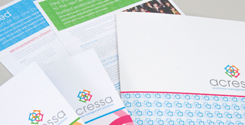
Using four ‘a’ characters, and interlocking them into a logomark that illustrated the four components of Acressa coming together for a full solution package. Bright, confident colors set the brand apart from competitors, and a full logo system created consistency and immediate brand recognition.
Marketing materials made liberal use of the logomark in patterns with bright color blocks, and instantly set Acressa apart from its competitors with a sophisticated look and feel.
About The Author
