Year: 2014
Year: 2014
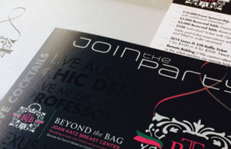
Beyond the Bag
The client wanted a metallic modern chic look and feel on a low budget. With low quantities the invitation was printed on a digital gray metallic paper to give it the modern look and feel. With a client request of adding exciting descriptive words to the cover it originally made the invite very busy, the
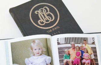
DetailsThe Jewel Book
It was a great pleasure to be involved with Jewel Charity on The Jewel book. The book had a tight deadline and firm budget to abide by. From start to finish I was hands on with the client and vendor. Although the client came with an approved logo and theme for the book, problems did
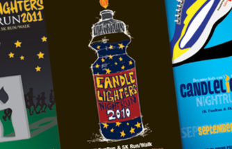
DetailsCandlelighters Nightrun
What a fun project. Candlelighters is a great organization that raises money to fight childhood cancer with a nightrun. Everyone in the shop wanted to work on this project each year when it came in, since the client gave us free-range on the design. Letting my creativity come out I would design a conceptual and
DetailsTexas Instruments
Creating an environmental graphics program for a newly renovated SC (Semiconductor) Building of TI was challenging and extensive, but I handled it with ease. Entrances, lobbies, conference rooms, training auditoriums, offices. Windows, walls, doors, vast hallways all had to be addressed with graphics that stayed with the companies graphic standards guide. Displays needed to be updatable,
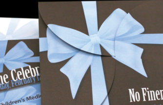
DetailsCook Children’s
Create an event invitation that will bring to light the largest fund-raising effort in Tarrant County, expand the knowledge about the cause. Bring awareness of the gift from the generous and powerful fund-raising engine Jewel Charity to Cook Children’s Medical Center—whose mission is to help critically ill children. Deliver a concept that opens like a
DetailsAmeriflex Workforce Solutions
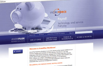
AmeriFlex decided to expand into the HR and Payroll field, and needed to launch the new platform in a way that not only created its own identity, but aligned perfectly with the existing AmeriFlex brand. With launch date approaching, they also needed it done quickly. Realigning the color scheme into a unique palette that still
DetailsDesigns for Living
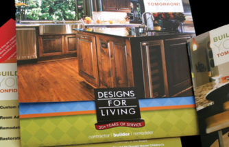
With dated corporate marketing materials, this design/builder/contractor needed to showcase new work and compete in a tight marketplace—but still distinguish themselves as a quality, trustworthy builder. I used their square logo to influence a package of marketing materials—all square—designed to re-enforce their brand. Project and informational inserts were created to fit into a cost-efficient glue-less
DetailsNiagara Conservation
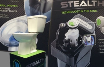
With outdated trade show graphics and displays a fresh new technology look was applied. First task was to find backdrops that would be easy for the team to put up at the show. With research a great solution was found in inflatable 10 foot backdrops that fit in a carry on and install in minutes.
DetailsCancer Care Services
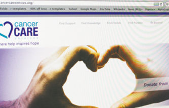
The client tasked me with creating a new brand. “We want people to know what we do—and how we can be helpful for cancer patients.” I implemented e-commerce accounts and an online presence at zazzle.com to generate additional income streams for this non-profit client. “Ecstatic. WOW, OMG was their response.” Credibility was emphasized online and
DetailsAcressa
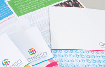
Lukewarm response to first pass at branding and marketing a startup workforce management company led the client to engage us for a new brand package that was dynamic, exciting and fresh. Using four ‘a’ characters, and interlocking them into a logomark that illustrated the four components of Acressa coming together for a full solution package. Bright, confident
Details