Creating a Distinctive Brand for a Workforce Management Startup
Challenge
As a growing workforce management company, Acressa needed a brand identity capable of communicating innovation, credibility, and expertise in a highly competitive market. An initial branding effort failed to gain traction with stakeholders, resulting in a lukewarm response and concerns that the visual identity lacked the energy and differentiation necessary to support the company’s growth ambitions.
The challenge was to develop a brand system that felt modern, dynamic, and memorable while clearly communicating Acressa’s ability to bring multiple workforce solutions together into a unified offering.
Strategy
Rather than focusing solely on aesthetics, the brand was built around the core value proposition of integration.
The goal was to visually represent how Acressa combines multiple workforce management components into a seamless solution for its clients. This concept became the foundation for both the logo system and the broader visual identity.
The brand needed to stand apart from competitors that often relied on conservative corporate aesthetics, while still maintaining the professionalism required to earn trust in a business-focused environment.
Execution
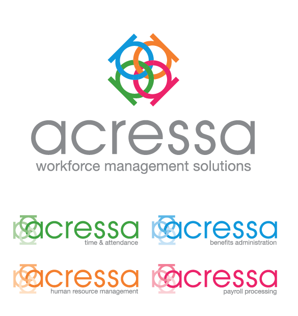
The identity was developed using four interconnected “A” forms, creating a custom logomark that symbolizes the four core components of Acressa working together as a complete workforce management solution.
The resulting mark created a visual representation of collaboration, connection, and integration while providing a flexible graphic asset that could extend throughout the brand experience.
To reinforce the company’s forward-thinking positioning, I developed a vibrant color palette featuring bright, confident colors that immediately differentiated Acressa from competitors. A comprehensive logo system was created to ensure consistency across all applications while providing flexibility for future growth.
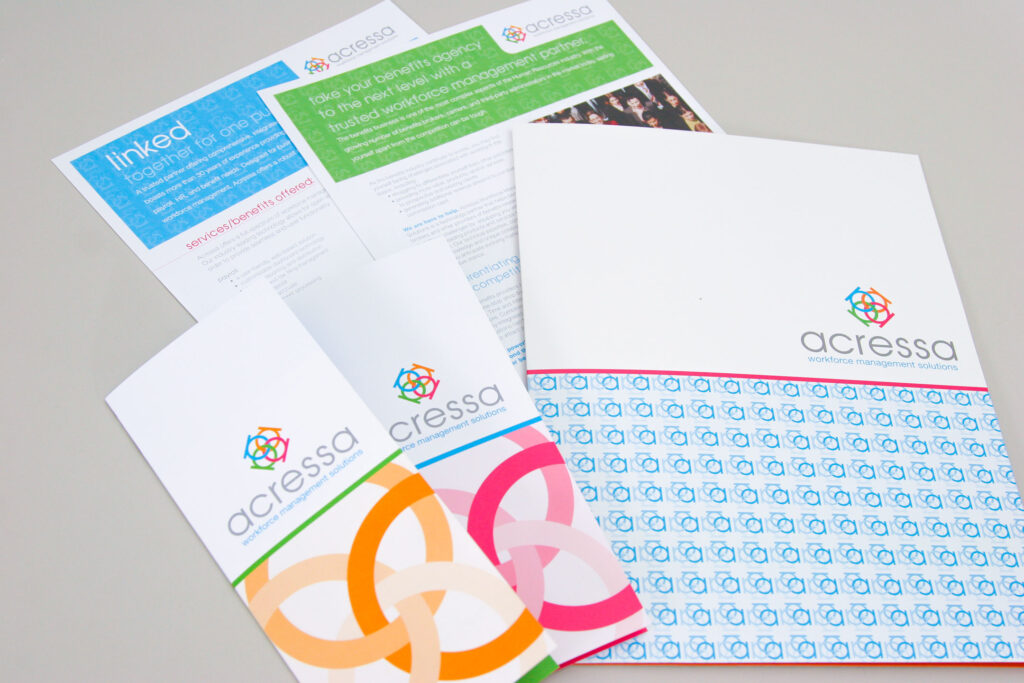
The visual language extended beyond the logo itself, incorporating the mark into patterns, graphic elements, and marketing materials. Bold color blocking, clean typography, and strategic use of the symbol created a cohesive and recognizable brand experience across every touchpoint.
Results
The rebrand transformed Acressa’s visual presence from a conventional startup identity into a distinctive and memorable workforce management brand.
The new system provided:
- A unique visual position within a crowded marketplace
- A scalable identity system capable of supporting future growth
- Strong brand recognition through consistent visual application
- Clear communication of Acressa’s integrated solution approach
- A modern, professional aesthetic that balanced credibility with innovation
More than a logo redesign, the project established a strategic brand foundation that helped Acressa communicate its value more effectively, differentiate itself from competitors, and present itself as a confident leader in workforce management solutions.